
A two-year project to replace the exterior of the Cannacord Tower at the corner of Granville and Dunsmuir proceeds. (More here in the Daily Hive.)
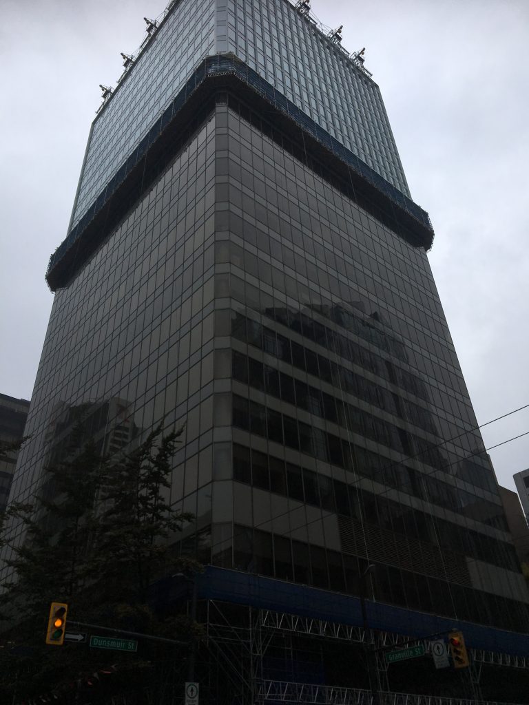
It’s not technically a curtain wall, but the project does entail the replacement of over 145,000 square feet of window panes – and a change of colour. Which has always been a sensitive point in this city.
The building, originally named the Stock Exchange Tower when it was completed in 1981, was one of four in the Pacific Centre complex, and it was intended to be as black as its predecessors to the south: the Toronto Dominion and IBM Buildings. (Changing Vancouver tells the story here.)
 The so-called Dark Towers were reviled by Vancouverites, who saw them as soulless symbols of the modernism that was ravaging the city at the same time as its treasured heritage was being demolished (the Birks Building, pretty much all the West End). City council in response required that the subsequent buildings in the complex have some richer, more sensitive colour. We ended up with beige.
Even the connected Eaton’s building (now Nordstrom’s), though white, was treated contemptuously (‘the giant urinal’), regardless of its architectural parentage. Cesar Pelli was the design architect, working for Victor Gruen Associates, but the inspiration for the black towers was clearly Ludwig Mies van der Rohe, best known for the most famous International Style building in the world: the 1958 Seagram Building in New York.
 Toronto-Dominion Bank wanted an architectural statement for Vancouver in the spirit of its newly completed headquarters in its namesake city. The bank’s chairman, Allen Lambert, took the recommendation of his sister-in-law Phyllis Lambert and retained Mies for the project. (Phyllis Lambert has previously convinced her father Sam Bronfman to retain him for the Seagram Building. All very cosy, no?)
Vancouver would have had a junior version of “the largest Mies in the world,” as Philip Johnson described TD Centre. Not that Vancouverites would have cared much. We just didn’t want more black towers – and have never had one since (with the possible exception of the Wall Centre, which was described by Peter Wall, the developer, as ‘translucent.’ When the actual class went up on the hotel tower, it was clear that the glass wasn’t – and hence the two-tone look until 2011, when the upper part was reclad.)
Over the years, Pacific Centre has had modifications, additions, and soon demolitions, as the Four Seasons Hotel is likely to be replaced. The only sure thing that can be predicted: we’ll complain about the colour.


Timely article in today’s Globe & Mail about modifications to modernist buildings.
Killing Toronto’s modernist architecture by bits and pieces
https://www.theglobeandmail.com/real-estate/toronto/article-killing-torontos-modernist-architecture-by-bits-and-pieces/