
Karole Sutherland writes from Spain:
SALAMANCA
We are visiting Salamanca, Spain and I couldn’t help admiring the clear demarcation of the bike and walking paths here. So much better than Vancouver’s oh-so-subtle signage mounted about 4 meters high on sign posts or via the occasional glyph on the pathway.
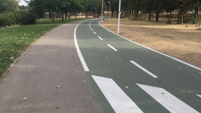
We live in Coal Harbour and watch the chaos as tourists take the wrong turn along the seawall – either as cyclists on the walking path or stroll down the bike path. It’s mayhem and for the most part, it’s because it’s not easy to figure out where you are supposed to be unless you live in Vancouver and know the secret handshake.
I don’t know the population of Salamanca but it’s nowhere close to Vancouver. So why can’t we do something smart like this and make it clear for everyone?


So true. It needs to be very obvious where to do which activity.
I’m tired of people being blamed for doing the wrong thing when in many environments it’s not clear what the right thing is.
Re the current lines on Point Grey Road. Casual groups of cylists often wander and
would create a confused scene in salamanka. When PGR is finally repaved just put
a single line down the centre. The east flow is marked shared traffic, bike and auto.
The west lane is bike only.
Many of the Metro Vancouver paths seem designed for aesthetics, not whether they work and are safe for pedestrians and cyclists. For example the too subtle marking and signage of the seawall at the conference centre, the circle pattern on the North Shore Spirit Trail crosswalks, and the curvy layout with poor sight lines of many shared use paths.
That path looks fantastic!
I agree that the relying on a user recognizing that asphalt=bikes and paving stones=pedestrians is very tenuous.
The small overhead signs are not in users’ sightlines, either.
There should be separation between the bike and ped path.
You should look at the photo before commenting though. There is no one using the grass either. I suspect it is just the time of day.
Paths are often the most popular amenities in parks plus people need to get there somehow. Better to walk or bike than plug the roads with even more cars.
________________________________
There are no people visible in the park. Are you suggesting that perhaps no park was needed either?
You know, I used to think that all the counters they have on bike paths were unnecessary. Now I see that some people can’t believe that many people cycle. They glance over from their car window or look at a photo online and at that instant don’t see many people cycling and extrapolate from there.
I’m glad that the decision makers have evidence to draw from.
For that matter this type of delineation is needed on Multiuse paths in many, many jurisdictions!
We don’t know when the picture was taken. The photographer might have waited for the crowd to pass until taking it so they could get a clean shot of the path. Traffic, including walking and cycling traffic tends to go in waves.
But yeah, painting half green is excessive. You just need a little line in the middle and symbols at intervals.