
A few weeks ago, an email discussion among some high-profile urbanists appeared in the PT inbox about this:

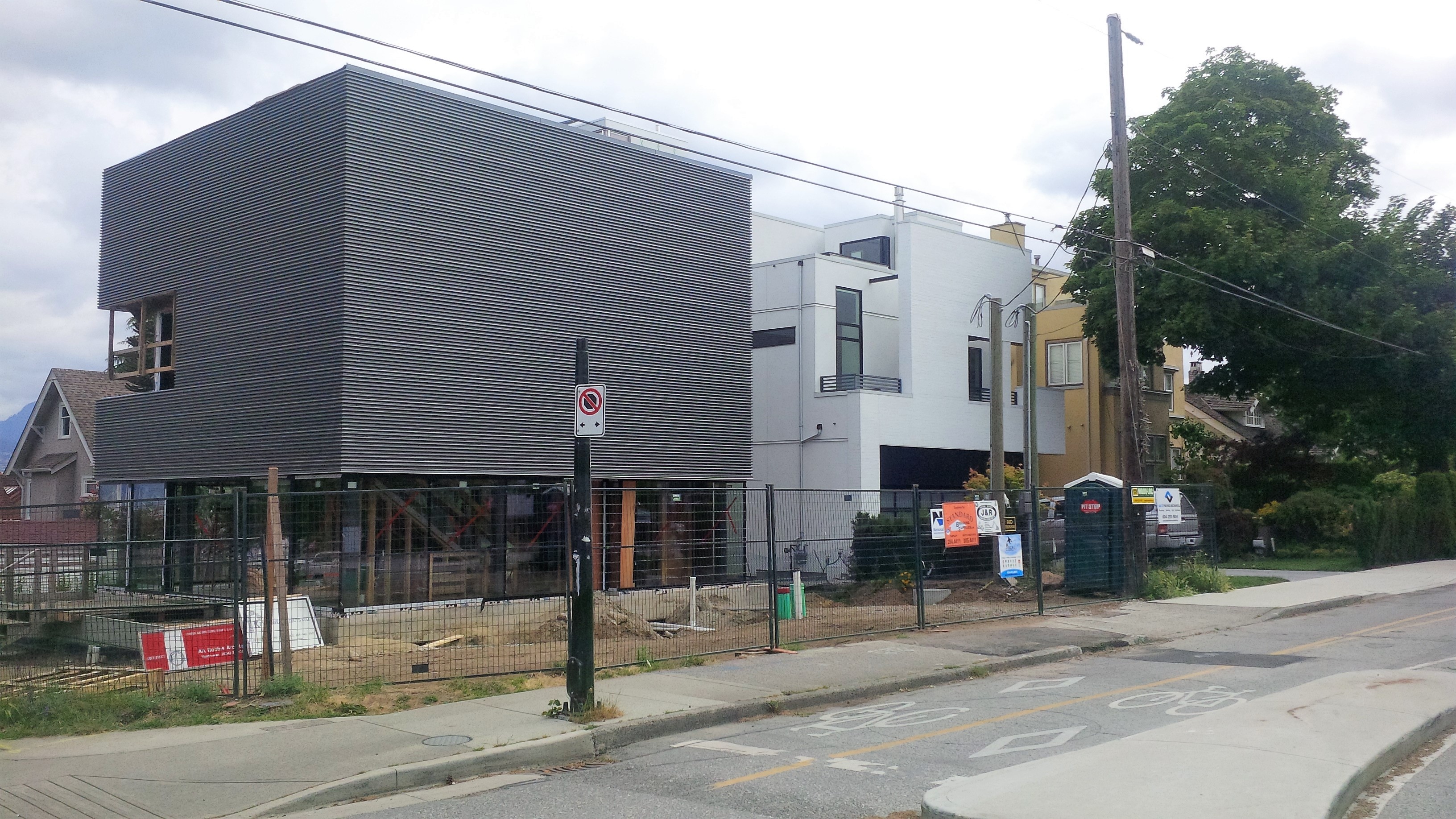
It’s a new house, just being completed, designed by Tony Robins (details here), located at a high-profile intersection at Point Grey Road and Alma.
The discussion began with this observation:
Richard Johnson:
Sitting on the northeast corner of Point Grey Road and Alma, directly across from Hastings Mill Park rises my nomination for Vancouver’s Most Hideous Urban Design for 2016. Actually, maybe for this century.
Thoughts on how this fits into the neighbourhood and enhances this special setting across from Hastings Mill, adjacent to the bikeway and at the entrance to Jericho Beach?
Others weighed in:
Michael Alexander:
My respectful Canadian half says to stay out of this, and just enjoy your wonderful comments on taste, style and context. But my American half wins out this morning, and I have to respond to neighbourhood context.
Actually, I think it will respond well to a neighbourhood that most values privacy, while providing, to passing cyclists and runners, peaks of great wealth (three-and four-car garage doors, occasional glimpses of a Bentley Mulsanne or Mercedes AMG).
Like most of its neighbours, it will be surrounded by a high wall, or more likely by a dense 3 or 4 metre tall cedar hedge. Eyes on the street will never see the burglars hiding in the foliage. “Closes itself off to… the neighbourhood?” That’s the point of Point Grey Road.
Graham McGarva
Thursday – 9 am
I could never understand why people want to live in lonely single-family houses with all that wasted space around them. Clearly the owner of this house feels the same, but was unable to find a big enough condo and had to recreate one overlooking some vacant scrub land that doesn’t even function as productive agriculture, but at least is only four blocks from transit.
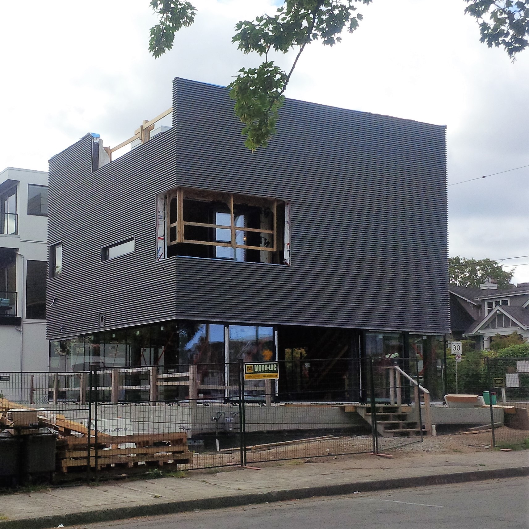
Ok,ok – I saw this when it was being framed and wondered when they were going to cut the holes in the sheathing. Now I will have to go on another bike ride, but only as long as you don’t expect me to wear a helmet.
Thursday – 12:03 pm
Nothing like a field review to see things more clearly.
It certainly fits the context along the north side of Point Grey Road of blank walled mansions, with all kind of surface decorations like closed blinds that never welcome eyes from the street, and blank arrays of garage doors for the display of luxurious automobiles. The urban gesture is a raised middle finger of exclusive solidarity and solid exclusiveness.
At least this home (with its future hedge or fence), will feel welcoming the moment you wheel your bike in through the front gate. The whole ground floor is glazed, with the stairwell providing a screen by the front door, and there will be more livable indoor/outdoor space to the south and west of this lot than on the rest of the block added together.
Passersby flooding to their tennis or yachts won’t be creamed by cars and bikes busily disobeying road signs, and the house next door to the east will retain its wide open views westwards over the car pit behind this house.
With the roof top screens and trellises, it is the perfect urban penthouse, with ground oriented livable open space, which is what I thought single family homes are all about.
The issue for us is that it is an accurately stark representation of what an executive home is all about. We all have memories and different aspirations. These create expectations and we fossilise them in rules. It would be dangerous for babies to play hockey on this street, so this house does not encumber the issue with crash helmets and their blind spots.
I won’t say that I like it, but I do prefer peekaboo as being more appropriate for urban living than wall to wall glazing with permanently closed blinds, and I can visualize enjoying this environment – which is more than I can say for the mansions along this street.
Now the south side of the street tells a different story, and it is those raised porches that make us think of community.
But then, I spent my whole career trying to make sure I did not have to work on single-family houses!
Michael Kluckner:
This is maybe the ultimate expression of the courtyard culture we’ve become, compared with the front porch culture which built neighbouring houses in generations past.
On the Heritage Commission, we are trying to encourage architects to design infill buildings which are identifiably modern but reflect some of the rhythms and proportions of the historic piece. The best one recently (although the neighbourhood probably still hates it) has been the infill design in the Mole Hill block, behind a privately owned historic cottage, by Tim Ankemann.

Tom Phipps:
Guidelines were adopted when Vancouver decided that rigid bylaws were inhibiting design. They are meant to allow for variation. If we are to avoid the city becoming pickled in place, to become a more interesting, yet neighbourly place, design guidelines should not be a rigid template or prescription.
“Intent” should be clear and policy derived. While it is easier for designers and staff to follow diagrams and ‘guide line’ statements, these should be seen as one way to achieve the “intent”. We should encourage designers to find other and better ways and not obstruct innovation, provided it avoids intrusive impacts and achieves policy intent.
This would favour more capable designers. It challenges fixed … usually unquestioned mental images. It may not favour ‘iconic’ but can allow for evolution in design and need not be unneighbourly.
Council will need patience for the process. Neighbours will not make it easy. They too are more familiar with having a rule book, though rules are always for the other guy. No and yes are both faster than “maybe, let’s work through it”. It should not be a zero-sum process.


I think the main thing to realize here is that the site is land-locked, and a house will likely be built across the alley to the north.
So the views are really to the west and northwest over the park.
http://i.imgur.com/lu0qwNz.jpg
The oddest thing to me is the near absence of glazing on the 2nd floor, except that NW balcony (which doesn’t look to have a window, if that’s a door). There should be more glazing facing the park.
As for the south side, hopefully there’s a large skylight above the staircase.
There’s a bit of a dichotomy at play here – there’s the extreme privacy of the upper floors, yet the ground floor is highly exposed to passersby with full glazing. Future landscaping may block the views out (and in) from the ground floor and have the residents wish for more views from the 2nd floor.
With the City’s declared plan to take almost all of the setback on the North side to build a redundant 9-foot wide sidewalk and 4-foot wide boulevard infront of all the North-side properties on Point Grey Road between Alma and Macdonald streets, this house will have its front door essentially at the sidewalk’s edge for all passers-by to gawk into any windows, disturb with noise and vandalize without having to leave the sidewalk. Ugly though the structure is, it suits the bill of trying to achieve at least some privacy where there won’t be any. The moat surrounding the house may also dissuade the riff-raff, especially if it is electrified.
The south elevation is directly exposed to the east/west new bike lanes and a very close sidewalk. So the probability is that this side will have substantial landscaping to reduce the constant looking inside of passers by. The west side along Alma has a reflecting pool which will necessitate a secure barrier for required security.
In this neighbourhood the accent is on the views across the water to the north. Therefore, the stairs go up along the south side. There does appear to be a skylight in the south east corner. Traffic going north and then east on Point Grey Road is also avoided, both day noise and night lights, by having this elevation opaque.
Many people want privacy.
The aesthetics are somewhat jarring in certain contexts but not really along this stretch of the quasi-gated elite bike trail. It’s a lot better than neo-Cape-Cod, neo-craftsman or neo-italianate villa, or neo-chateau. It’s modern and honest.
This project is an elegant essay on the nourishing power of the biosphere. There are no walls on the ground plane only privacy screens at the property lines, above the living areas floats the enclosed nest with its lookouts, and on the top the final retreat into landscape made private with sun, moon, atmosphere and ocean. This home illustrates all that is lost by the densification of our lives.
I agree with all except the last sentence .. there is nothing about the former that can’t also be done with greater density.
Was the building permit issued on the 1st of april ?
Perhaps this hideous cube is a sideways tip of the hat to the bunkers of the WWII military base at nearby Jericho.
While I do admire some modern syncopation and variation in a residential streetscape, I think the architect got this one backwards. I would have put the contemporary white home on the corner lot, and the cube could go next door as an understated and secluded experiment. Except for the fact that the white home is really no masterpiece either. But no matter; it’s not like the rest of the neighbourhood hasn’t already received a complete makeover.
Take a stroll down Cameron Ave, and you’d be hard pressed to find much left in terms of heritage retention. Most of the homes have either been completely made over, or recently demolished and rebuilt. The main exception is the home directly behind the cube; a lovely little bungalow, and a tiny little summer cottage next door, built in 1925 and 1926 respectively. The rest of the homes look like modern mega mansions or faux heritage homes.
Look up the addresses on VanMap, and you’ll see there are actually 4 older houses on the north side of the street, and 8 older homes on the south side of the street, though you would be hard pressed to distinguish which homes were built in the 20s and which were built in the 80s. I’m also prepared to bet Tony Robins designed 3628 Cameron, the yellow house down the street?
For my money, the most interesting home on Cameron Ave is the one at the end – 3617 Cameron, built in 1974. Modestly understated from the street, it is immense and multi-tiered from the water. Who was the architect, and who was the home built for in the mid 70s? It must have been the Chip Wilson of the day! And what is with that tiny triangular lot next door, 3607 Cameron, which looks so small you couldn’t park a car on it?
Just plain UGLY. Why the hell are we allowing this crap to be built in beautiful Vancouver?
My five year old granddaughter architecture critic declared of this house: “I would scream at the people who made it, chop off their heads, then throw them in jail.”
Apart from the violence, I concur!
I like it. Wish I could see the floor plan….
Nimby nimby nimby
Always need to criticize, or evaluate it at 100% or 0%. Where is the nuance, subtlety of a careful, balanced, and thorough estimation of this house? Architecture is more than what it looks like, and should be more than “love it” or “hate it”.
Everthing this house wants to do as been done better elsewhere. It tries to do some nice things. Other houses have done them better, without the big blank wall of death facing the public street. I love most of the house, I hate a few aspects. There you have nuance that isn’t simply love or hate.
We are Borg
Prepare to be assimilated
Resistance is futile
This is not challenging architecture. It’s boring. An open deck rooftop and an open concept kitchen/living space are not challenging.
The parkade is nice. The cars will be happy. Maybe the owners will decide to turn it into a living space. Have to watch out for the Point Grey Whiners though. They’ll burn up the phone line to the city.
Where’s the laundry room?
The problem with architects and builders is that, by and large, they don’t do laundry. They stick a stacker in a closet and say: “Job done.” It’s not. It sucks.
The laundry room is important. It should be large, airy, and comfortable. It should have tons of workspace and closets. Ideally, there would be a clothesline accessible from this space. The bathroom must be adjacent.
Clothing shouldn’t ricochet from room to room. Most of it should take up permanent residence in the laundry room closets.
If architects and builders did laundry, this room would become the new man cave. Deluxe.
Architects and builders don’t do much cooking – which is why their kitchens are so bad. The kitchen sink must be in an outside corner with the best light and views. It should be surrounded by stainless on both sides, not dropped into a slab of stone. That’s absurd – and stupid expensive. The backsplash should also be stainless. Get the whole shebang fabricated.
The shelves surrounding the sink must be open. Otherwise you’ll go crazy opening and closing cupboard doors.
If you want granite, or other idiotic stone counter, have it put down in one piece. Bamboo is better. A small marble piece is nice if you do pastry.
The fridge and stove must be within, at most, a pivot’s reach. Proprioception. If you stick an island in the middle of this holy triangle you must be locked up with a book on kitchen ergonomics.
The fridge is the monster in the kitchen. Do what you can to attenuate the noise of this animal. To have it adjacent to a living room in an open concept is to never escape its penetrating sound. That’s what walls and doors are for. Open concept is the dumbest concept – except for builders for whom it’s way cheaper and easier to throw up, and sellers who wow buyers with the apparent size and misguided notion that they’ll be entertaining. Hello lonely people – having an open concept kitchen does not make you entertaining, nor will you entertain. Don’t be a sucker.
The genius that invents a good silent fridge will make a fortune. It’s ironic that in the days of yore ice boxes were silent while we suffer the rumbling, hissing, clanking fridges of modernity.
Albert Einstein is the genius that invented the silent fridge in 1926 known as the absorption refrigerator based on a heat source. The idea did not make him rich. He was widely famous however for his insight into the relativity of space and time, and rightly so as it is a conceptualization that revolutionized our understanding of the universe.
More to the point however; doors and walls are not needed to contain imaginary monsters.
Open space is not a concept and one need not fear such places as presenting some kind of existential crisis where we suddenly find ourselves to be alone with our dumbest thoughts, a circumstance which by the way is hardly a profound critique of architectural design.