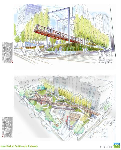
I think the elevated walkway is a stroke of genius! Yes, it’s reminiscent of the High Line. But so what? It brings a 3-D element to a site that is currently very flat. It looks fun! And the ample common space for events, farmer’s markets, etc. is refreshing, in a part of the city that is sorely lacking in communal space.
The elevated walkway will keep your kids thrilled/occupied for at least a half an hour. It turns a ‘nice place to have your lunch alone’ into a mini-destination. It’s a positive feature.
I would half agree with Ian F, though: There seems to be an overabundance of nooks and crannies and stuff crammed in, which in no doubt present some CPTED and maintenance issues over time. Never the less, it’s a design rich in original ideas, and the process cannot be faulted as it evolved from extensive public consultation with the potential users and neighbours.
On the plus side I really appreciate the multi-functional plaza and interconnections with other similarly programmed spaces located in the heart and buffered by terraced slopes. I hope the residents and city follow though with programmed events and foster more creative expression. The existing and proposed tree canopy is and will be the most important planted element on the site. The surface walkways seem to follow the likely desire lines.
A few thoughts on what may be better if changed:
– The ‘Back 40’ upper terrace needs more work. This is the point of prospect, the overlook where people will tend to gravitate when stopping here, the quietest space that also offers refuge, but as proposed remains as left over space. The issue is, what will attract anyone but the homeless to stop and stay at the top end? The key is to animate the space with human activity while respecting the neighbours. In my opinion the ‘coffee kiosk’ function should be placed on the upper edge with a generous sheltered seating terrace overlooking the park. This will provide impetus for people to stop and stay a while away from the heavier traffic at the intersection.
– The kiosk should be expanded from what appears to be a seasonal fold-up modular structure jammed into the noisiest corner of the site, to a permanent one-storey food concession building on the upper terrace, perhaps with more than one vendor and product choice. The population is very dense there and the cappuccino + muffin take-out crowd, not to mention the ample lunchtime traffic and the stay-an-hour-nurturing-a-latte-while-working-a-laptop generation, will populate the place all day and evening. The concession building should face the park with a well-designed paved terrace in front of it that is at least half covered and possibly heated to offer year-round use. In effect, the kiosk idea would expand into a full-service, year round small café. This will fulfil the unaddressed edge condition indicated by a café and terrace in the images. In fact, the park as illustrated does not have a Human Contact Zone relationship with its edges like that provided by ‘storefront’ related activity.
– The skyframe is a neat idea and offers a great way to suspend stuff like lighting, artful banners, sculpture and so forth. However, I think the elevated walk should be set at one elevation starting at the upper terrace / café and not humped up, be wider with perhaps some seating nodes, be gently curved instead of kinked, and extended all the way over Smithe to an actual destination or proper landing point in the next block or (even further … snaked through Yaletown perhaps?) instead of dead-ended over the mind-numbing traffic. The “gateway” idea seems too much like post-justification, form over function lingo for what is in reality an impractical airborne intrusion.
– Maintenance is also a mind-numbing word that too many landscape designers do not understand (or often purposely ignore beyond their portfolio shot). This issue is best thought of in full life-cycle accounting and biological terms, and in the context of the multiple millions in taxpayer dollars devoted to maintenance and replacement in municipal operating budgets. My experience with small biofiltration swales over the decades has been very illuminating. They silt up and provide ideal growing medium for rushes and algae. They collect garbage. Their benefits are extremely token when placed in the context of a downtown with several square kilometres of drained, oil splattered asphalt. They are not even close to the benefit of a fully daylighted stream with proper riparian setbacks. They look cool on paper and they sell the idea of being “green”, but in practice my guess is that Parks staff will have to remove it or plant it up within a decade due to the ongoing maintenance issues. The same applies to too many understorey shrubs in an urban context that will be plagued by invasives, trampling and CPTED issues. This is an urban park, and the design must be urban right down to the unfun stuff like drain grates and horticultural upkeep.
Having said all that, I think the design is one of the more innovative I’ve seen in a long time.
Check our Patreon page for stylish coffee mugs, private city tours, and more – or, make a one-time or recurring donation. Thank you for helping shape this place we love.


Oh look our own mini-me High Line. How original.
You obviously skipped over the design panels, Bob.
Seems over-programmed, with the elevated walkway and the sky frames push it over the edge,
I think the elevated walkway is a stroke of genius! Yes, it’s reminiscent of the High Line. But so what? It brings a 3-D element to a site that is currently very flat. It looks fun! And the ample common space for events, farmer’s markets, etc. is refreshing, in a part of the city that is sorely lacking in communal space.
The site actually slopes down to the alley – so the walkway is a great way to counteract that downhill slope.
And the screen of trees should work well to screen the alley and the blank concrete of the back of the Bing Thom tower.
The elevated walkway will keep your kids thrilled/occupied for at least a half an hour. It turns a ‘nice place to have your lunch alone’ into a mini-destination. It’s a positive feature.
An intriguing concept!
I would half agree with Ian F, though: There seems to be an overabundance of nooks and crannies and stuff crammed in, which in no doubt present some CPTED and maintenance issues over time. Never the less, it’s a design rich in original ideas, and the process cannot be faulted as it evolved from extensive public consultation with the potential users and neighbours.
On the plus side I really appreciate the multi-functional plaza and interconnections with other similarly programmed spaces located in the heart and buffered by terraced slopes. I hope the residents and city follow though with programmed events and foster more creative expression. The existing and proposed tree canopy is and will be the most important planted element on the site. The surface walkways seem to follow the likely desire lines.
A few thoughts on what may be better if changed:
– The ‘Back 40’ upper terrace needs more work. This is the point of prospect, the overlook where people will tend to gravitate when stopping here, the quietest space that also offers refuge, but as proposed remains as left over space. The issue is, what will attract anyone but the homeless to stop and stay at the top end? The key is to animate the space with human activity while respecting the neighbours. In my opinion the ‘coffee kiosk’ function should be placed on the upper edge with a generous sheltered seating terrace overlooking the park. This will provide impetus for people to stop and stay a while away from the heavier traffic at the intersection.
– The kiosk should be expanded from what appears to be a seasonal fold-up modular structure jammed into the noisiest corner of the site, to a permanent one-storey food concession building on the upper terrace, perhaps with more than one vendor and product choice. The population is very dense there and the cappuccino + muffin take-out crowd, not to mention the ample lunchtime traffic and the stay-an-hour-nurturing-a-latte-while-working-a-laptop generation, will populate the place all day and evening. The concession building should face the park with a well-designed paved terrace in front of it that is at least half covered and possibly heated to offer year-round use. In effect, the kiosk idea would expand into a full-service, year round small café. This will fulfil the unaddressed edge condition indicated by a café and terrace in the images. In fact, the park as illustrated does not have a Human Contact Zone relationship with its edges like that provided by ‘storefront’ related activity.
– The skyframe is a neat idea and offers a great way to suspend stuff like lighting, artful banners, sculpture and so forth. However, I think the elevated walk should be set at one elevation starting at the upper terrace / café and not humped up, be wider with perhaps some seating nodes, be gently curved instead of kinked, and extended all the way over Smithe to an actual destination or proper landing point in the next block or (even further … snaked through Yaletown perhaps?) instead of dead-ended over the mind-numbing traffic. The “gateway” idea seems too much like post-justification, form over function lingo for what is in reality an impractical airborne intrusion.
– Maintenance is also a mind-numbing word that too many landscape designers do not understand (or often purposely ignore beyond their portfolio shot). This issue is best thought of in full life-cycle accounting and biological terms, and in the context of the multiple millions in taxpayer dollars devoted to maintenance and replacement in municipal operating budgets. My experience with small biofiltration swales over the decades has been very illuminating. They silt up and provide ideal growing medium for rushes and algae. They collect garbage. Their benefits are extremely token when placed in the context of a downtown with several square kilometres of drained, oil splattered asphalt. They are not even close to the benefit of a fully daylighted stream with proper riparian setbacks. They look cool on paper and they sell the idea of being “green”, but in practice my guess is that Parks staff will have to remove it or plant it up within a decade due to the ongoing maintenance issues. The same applies to too many understorey shrubs in an urban context that will be plagued by invasives, trampling and CPTED issues. This is an urban park, and the design must be urban right down to the unfun stuff like drain grates and horticultural upkeep.
Having said all that, I think the design is one of the more innovative I’ve seen in a long time.