
Now this is fun – and quite extraordinary.

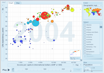
The latest Beta test from Google can be found here – charts that not only display complex data in interesting ways, but then allow you to see changes over time and the interrelationships that result. (It’s easier to see than explain. But be sure to play around with it to understand everything that’s happening. The Help section has other charts of interest too.)


This is quite an amazing tool for the visualization of a tremedous amount of data.
There are many applications of this tool. However, every student and citizen should use it to learn about the world in its present form in Gapminder.